On Videogame Box Art.
We’ve all been there. You have a little spare cash and wonder into a videogame shop. You’ve not got anything specific in mind, but perhaps you might buy a game. You head over to the stacks and start browsing.
What grabs your attention? Familiar titles? Perhaps. But what about games you’ve never heard of? What makes that game stand out from the others so that you pause, pick it up from the shelf and allow for closer inspection? The title plays a major role, but the factor many people don’t consider is the box art.
Videogame box art is very similar in many regards to comic book covers. You need something to catch a potential customer’s eye and get them to pick the product off the shelf from amid the myriad competing titles. While many titles and well known franchises can rely on their existing fame for the bulk of their sales, new franchises need to work hard to get noticed. Likewise, people who have recently come into gaming any may not be aware of the popularity of an existing game also have money to spend, so they can be targeted by good quality box art. ‘Casual’ buyers- people wondering in and not looking for anything in particular can also be persuaded by box art.
You can argue that a decent cover isn’t quite as important in this day and age when a person can gather all the information they want from the internet and gaming magazines (often using a Smartphone while standing in the shop), but every marketing guru knows that image is everything. For this reason today’s post is going to look at videogame box covers. The good, the bad, the ugly and reasons why.
Let’s start off with one of my personal favourite items of box art; Final Fantasy VII.
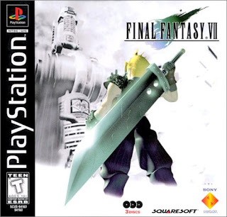
Box art has three main functions. In order of importance they are: grab the eye, engage interest and if possible, communicate something about the game. This cover does all three. To start with the bold white and washed out colour scheme makes it stand out far more against other titles as most videogames tend to use a darker colour palette on the box. The eye naturally tends to gravitate towards anything that upsets a pattern.
The cover generates interest immediately thanks to the extremely simple, yet highly communicative imagery and composition. Let’s look at this cover for a moment as if we’ve never played the game. First thing we see is a guy with a massive sword. Once we’re focused on the cover the eye is drawn to the break in the pattern- in this case that patch of colour. It also helps that he is in the foreground. So right away the massive sword engages interest. Who wields a weapon like that? Is this a serious game or a cartoon? We’re curious about it (even if it’s just to see if such a ludicrous weapon is explained), and that engages interest.
After noticing that, we take in the rest of the cover. Here the composition becomes extremely clever and achieves the third point of communicating a lot about the game, while generating interest. We see a tower in the background, which even though it appears to be quite far off climbs high over the character. The worm’s eye angle further enhances this idea, enforcing a perspective which makes the tower appear to be looming over the character.
At the same time we notice that the character appears to be ready to fight (his stance plus the presence of a weapon), while looking at this looming tower. This instils the idea of defiance against a greater power. The tower looks technologically advanced, so that shows us something about the setting too.
All of this is communicated immediately through extremely simple composition and perspective- without the need for words. It grabs the eye, it makes the viewer ask questions, and it communicates something about the game within. Most of all it means the viewer is more likely to pick the game up and read the blurb.
Okay, let’s take another look at a Final Fantasy title, this time VIII.

This cover is a classic composition, consisting of four elements and the title. How does it fare with the three step critique though? Well it is eye catching. The characters are bold and in the foreground, and people are drawn to faces. Making sure that the faces of these characters are large and bold helps the game to stand out- especially against other cases which may also feature characters in the art.
First thing we see is Rinoa as she is the brightest, most lightly coloured of the troupe. Pretty girl (apparently) on the cover- always helps to sell a product (at least to heterosexual males who are probably the largest demographic in gaming as far as sexual orientation goes).
Behind her and raised slightly we see two men who are positioned back to back, implying antagonism. Their position behind and slightly above her implies her involvement in the antagonism, which means a love triangle. Given that this is a pretty big part of the game it also helps in completing point three- communicating something about the title.
The fourth and final element is the sorceress in the background. Her position over the others and faded into the background implies overarching control, done in puppet master fashion from behind the scenes.
This is a pretty good cover; it’s a classic formula that you will see very often- especially in movie posters. It’s simple and while it is pretty bland it catches the eye and communicates something about the game. Sadly though, it doesn’t really do much to generate interest- at a glance it’s just three people standing there (four if you even notice the sorceress). Discounting the fact this game sold mainly on its credit as part of a very popular franchise, I don’t see this cover generating sales. It’s more there to generate interest in people who are already going to buy the game (who is the hero? Who is the mastermind? Who is the girl?). To anyone else it’s just an eye-catching but somewhat meaningless design. If I saw this on a shelf, my first thought would honestly be some sort of dating sim.
Here is a very similar design from the game Resonance of Fate:

If you saw this on the shelf, would you buy it? Would you even notice it?
First off we have the three characters- again lady in the foreground. However the colours are more muted brown tones which mean it is immediately harder for the game to catch the eye. The faces are less obvious and can actually be missed at a casual glance. How about generating interest? Well, we see the characters are dressed normally, the background is faded out to the point of being unnoticeable at a glance and the only thing we really see about the game is that there are guns.
There’s no implication of the story or of the elements therein, there’s no indication of the relationship between the characters (who all seem to be Matrix diving for some reason), and not even a sense of mystery to generate interest. The only reason to pick up this game is that the art direction is clearly Japanese, yet the characters are wearing normal clothes and wielding realistic guns (which is an oddity for a Japanese title). Perhaps that’s enough (it made me pick it up), but really this is a shoddy cover. It communicates very little, doesn’t really catch the eye and the interest it generates is more from the art direction of the game itself rather than any effort on part of the box art. Still, on that score it can at least do its job.
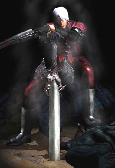
Next up is Marvel Ultimate Alliance 2.

This is a great example of niche marketing without relying on a connection to the franchise. This is a cover that will immediately grab a target audience (comic book fans), and make them want to know more- even if they’ve never even seen a videogame based on comic book IP.
There’s a big contrast between the dark red of Spidey and the glassy blue colour of the background. Contrast = pattern break, pattern break = eye catching. And really, once the target audience has seen this cover its work is done. We see a selection of Marvel characters from a different set of stories and styles, each isolated in their own piece of broken glass. This of course implies fracture, isolation and disharmony, as does the fact that their angry expressions seem to be mostly directed at each other. A comic book fan is going to have a look at this purely to see how a game can get all these disparate characters into one narrative, but seeing this expression of disunity also generates interest- why do they seem to be fighting?
The box art is eye catching- not as much as others but more so than most, and it generates interest in the game as well as communicating something about its contents at the same time. You’ve got a collection of superheroes and for some reason they don’t like each other anymore. It’s got very little appeal to anyone who doesn’t have a prior investment to these characters, but that’s the point- it’s exploiting a specific niche and it does that very well.
We will close on some of the worst box art I have ever seen.


I can talk about all of these at once because they are all the same image- and it is complete and total crap. From a marketing standpoint the box art is the last thing that was supposed to sell these games, but in a few years time when new people come into the hobby and the hype has died down, are they going to look at these images and think ‘I need that’? I doubt it.
Are they eye catching? No. It’s a single, bland image with minor variations on each. Does it generate interest? No. They all look alike, so why should one be any more interesting than any other? Do they communicate anything about the game? Hell no. Here’s what we can tell from these covers- soldiers exist and are a part of this game. Oh and one of them takes place somewhere dusty. This really is the pinnacle of lazy. These are games which are meant to be sold entirely on the basis of other marketing. And what's with the orange on the Battlefield 3 art? Did he spill his squash? There's no obvious light source from that angle and even if there was it doesn't cast any shadows. Does it have something to do with the smoke on that side of the soldier's body? Is it some sort of sci fi acid eating away at his body?
It’s sad that we’re moving farther and farther away from decent box art. Digital distribution is a fast growing medium, and while striking imagery is still an important part of grabbing the attention of any potential customer, scanning pictures on a screen just doesn’t have the same ring as holding a picture in your own hands. Anyway, if you’ve made it this far congratulations on surviving the aimless ramblings of a jaded neckbeard. If you ever end up in videogame marketing please spare me a thought when you decide on a game’s box art.
Love and peace y’all.
What grabs your attention? Familiar titles? Perhaps. But what about games you’ve never heard of? What makes that game stand out from the others so that you pause, pick it up from the shelf and allow for closer inspection? The title plays a major role, but the factor many people don’t consider is the box art.
Videogame box art is very similar in many regards to comic book covers. You need something to catch a potential customer’s eye and get them to pick the product off the shelf from amid the myriad competing titles. While many titles and well known franchises can rely on their existing fame for the bulk of their sales, new franchises need to work hard to get noticed. Likewise, people who have recently come into gaming any may not be aware of the popularity of an existing game also have money to spend, so they can be targeted by good quality box art. ‘Casual’ buyers- people wondering in and not looking for anything in particular can also be persuaded by box art.
You can argue that a decent cover isn’t quite as important in this day and age when a person can gather all the information they want from the internet and gaming magazines (often using a Smartphone while standing in the shop), but every marketing guru knows that image is everything. For this reason today’s post is going to look at videogame box covers. The good, the bad, the ugly and reasons why.
Let’s start off with one of my personal favourite items of box art; Final Fantasy VII.

Box art has three main functions. In order of importance they are: grab the eye, engage interest and if possible, communicate something about the game. This cover does all three. To start with the bold white and washed out colour scheme makes it stand out far more against other titles as most videogames tend to use a darker colour palette on the box. The eye naturally tends to gravitate towards anything that upsets a pattern.
The cover generates interest immediately thanks to the extremely simple, yet highly communicative imagery and composition. Let’s look at this cover for a moment as if we’ve never played the game. First thing we see is a guy with a massive sword. Once we’re focused on the cover the eye is drawn to the break in the pattern- in this case that patch of colour. It also helps that he is in the foreground. So right away the massive sword engages interest. Who wields a weapon like that? Is this a serious game or a cartoon? We’re curious about it (even if it’s just to see if such a ludicrous weapon is explained), and that engages interest.
After noticing that, we take in the rest of the cover. Here the composition becomes extremely clever and achieves the third point of communicating a lot about the game, while generating interest. We see a tower in the background, which even though it appears to be quite far off climbs high over the character. The worm’s eye angle further enhances this idea, enforcing a perspective which makes the tower appear to be looming over the character.
At the same time we notice that the character appears to be ready to fight (his stance plus the presence of a weapon), while looking at this looming tower. This instils the idea of defiance against a greater power. The tower looks technologically advanced, so that shows us something about the setting too.
All of this is communicated immediately through extremely simple composition and perspective- without the need for words. It grabs the eye, it makes the viewer ask questions, and it communicates something about the game within. Most of all it means the viewer is more likely to pick the game up and read the blurb.
Okay, let’s take another look at a Final Fantasy title, this time VIII.

This cover is a classic composition, consisting of four elements and the title. How does it fare with the three step critique though? Well it is eye catching. The characters are bold and in the foreground, and people are drawn to faces. Making sure that the faces of these characters are large and bold helps the game to stand out- especially against other cases which may also feature characters in the art.
First thing we see is Rinoa as she is the brightest, most lightly coloured of the troupe. Pretty girl (apparently) on the cover- always helps to sell a product (at least to heterosexual males who are probably the largest demographic in gaming as far as sexual orientation goes).
Behind her and raised slightly we see two men who are positioned back to back, implying antagonism. Their position behind and slightly above her implies her involvement in the antagonism, which means a love triangle. Given that this is a pretty big part of the game it also helps in completing point three- communicating something about the title.
The fourth and final element is the sorceress in the background. Her position over the others and faded into the background implies overarching control, done in puppet master fashion from behind the scenes.
This is a pretty good cover; it’s a classic formula that you will see very often- especially in movie posters. It’s simple and while it is pretty bland it catches the eye and communicates something about the game. Sadly though, it doesn’t really do much to generate interest- at a glance it’s just three people standing there (four if you even notice the sorceress). Discounting the fact this game sold mainly on its credit as part of a very popular franchise, I don’t see this cover generating sales. It’s more there to generate interest in people who are already going to buy the game (who is the hero? Who is the mastermind? Who is the girl?). To anyone else it’s just an eye-catching but somewhat meaningless design. If I saw this on a shelf, my first thought would honestly be some sort of dating sim.
Here is a very similar design from the game Resonance of Fate:

If you saw this on the shelf, would you buy it? Would you even notice it?
First off we have the three characters- again lady in the foreground. However the colours are more muted brown tones which mean it is immediately harder for the game to catch the eye. The faces are less obvious and can actually be missed at a casual glance. How about generating interest? Well, we see the characters are dressed normally, the background is faded out to the point of being unnoticeable at a glance and the only thing we really see about the game is that there are guns.
There’s no implication of the story or of the elements therein, there’s no indication of the relationship between the characters (who all seem to be Matrix diving for some reason), and not even a sense of mystery to generate interest. The only reason to pick up this game is that the art direction is clearly Japanese, yet the characters are wearing normal clothes and wielding realistic guns (which is an oddity for a Japanese title). Perhaps that’s enough (it made me pick it up), but really this is a shoddy cover. It communicates very little, doesn’t really catch the eye and the interest it generates is more from the art direction of the game itself rather than any effort on part of the box art. Still, on that score it can at least do its job.
Next up is Marvel Ultimate Alliance 2.

This is a great example of niche marketing without relying on a connection to the franchise. This is a cover that will immediately grab a target audience (comic book fans), and make them want to know more- even if they’ve never even seen a videogame based on comic book IP.
There’s a big contrast between the dark red of Spidey and the glassy blue colour of the background. Contrast = pattern break, pattern break = eye catching. And really, once the target audience has seen this cover its work is done. We see a selection of Marvel characters from a different set of stories and styles, each isolated in their own piece of broken glass. This of course implies fracture, isolation and disharmony, as does the fact that their angry expressions seem to be mostly directed at each other. A comic book fan is going to have a look at this purely to see how a game can get all these disparate characters into one narrative, but seeing this expression of disunity also generates interest- why do they seem to be fighting?
The box art is eye catching- not as much as others but more so than most, and it generates interest in the game as well as communicating something about its contents at the same time. You’ve got a collection of superheroes and for some reason they don’t like each other anymore. It’s got very little appeal to anyone who doesn’t have a prior investment to these characters, but that’s the point- it’s exploiting a specific niche and it does that very well.
We will close on some of the worst box art I have ever seen.


I can talk about all of these at once because they are all the same image- and it is complete and total crap. From a marketing standpoint the box art is the last thing that was supposed to sell these games, but in a few years time when new people come into the hobby and the hype has died down, are they going to look at these images and think ‘I need that’? I doubt it.
Are they eye catching? No. It’s a single, bland image with minor variations on each. Does it generate interest? No. They all look alike, so why should one be any more interesting than any other? Do they communicate anything about the game? Hell no. Here’s what we can tell from these covers- soldiers exist and are a part of this game. Oh and one of them takes place somewhere dusty. This really is the pinnacle of lazy. These are games which are meant to be sold entirely on the basis of other marketing. And what's with the orange on the Battlefield 3 art? Did he spill his squash? There's no obvious light source from that angle and even if there was it doesn't cast any shadows. Does it have something to do with the smoke on that side of the soldier's body? Is it some sort of sci fi acid eating away at his body?
It’s sad that we’re moving farther and farther away from decent box art. Digital distribution is a fast growing medium, and while striking imagery is still an important part of grabbing the attention of any potential customer, scanning pictures on a screen just doesn’t have the same ring as holding a picture in your own hands. Anyway, if you’ve made it this far congratulations on surviving the aimless ramblings of a jaded neckbeard. If you ever end up in videogame marketing please spare me a thought when you decide on a game’s box art.
Love and peace y’all.